
Let’s dive deep today into how we look at designs. We all want our slides to be seen and read as we want them to, don’t we? To better arrange the elements in a presentation, you need to understand how the human eye processes the designs. A comprehensive understanding of how the eyes work and how they move across a slide, page, or image is critical to the success of your presentation design.
As a presenter, it is fascinating to learn what readers read first, how they move to the second, third thing, and so on, and where their eyes fixate for the longest duration. Below, we have outlined some valuable findings on eye tracking and practical tips that you can use to guide your way. Take a look.
1. Gutenberg Rule or the Z Pattern of Processing Information
The Gutenberg principle assumes the design space to be divided into four quadrants, amongst which the top-left and bottom-right are considered active quadrants. In contrast, the bottom-left and top-right are passive quadrants. So, the top-left corner of your slide or image gets the attention first.
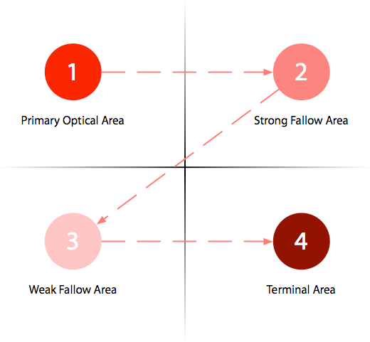
Prioritizing information and fitting the most critical contents in the primary and terminal areas is essential. Keep the most crucial information or element in your slide – say, the heading – on the top left. Look at how Microsoft and Twitter have strategically placed their logos in the top-left corner.
If your presentation needs to include text-heavy slides, use the top-left and bottom-right areas wisely and keep the less important information in the top-right section. Call to action (CTAs) should be kept for the terminal region of the slide because they are the last things viewers need to see to take action.
2. F-Pattern in Reading
As per the study by the Nielsen Norman Group, 80% of the viewers’ time is spent on the left half of the page, and 20% is spent on the right half.
The F-pattern suggests that readers usually start reading across the uppermost part of the content area in a horizontal movement (F’s top bar). Then they move down the page a bit to read across in a second horizontal movement, forming the F’s lower bar, typically covering an area shorter than the previous movement. Finally, they go through or scan the left side of the page or content in a vertical movement, forming the F’s stem.
So, for your presentation, keep the most important message on the left. The critical question – text or visual? A visual presentation is more compelling, so focus on the visuals and keep them to the left.
The F-pattern also adds one more intriguing consideration regarding the users’ habit of skim reading, which will help you add value to your design. So, include the key points on the slide in the first two paragraphs and use headings/subheadings. Also, start these headings/subheadings with the words carrying the most weight or value. Use numbers and bullets to call out items in a process or list.
By adhering to this design convention, we are sure you will be able to maximize users’ efficiency and engagement in your presentation instantly.
3. Large, High-Quality Images Over Text
Text-heavy slides with paragraphs leave the viewers darting between the content on the slide and the speaker, possibly missing both in the process. To improve your presentation, you need to reduce the text density on your slides; the text is unarguably essential but keep it minimal.
Using blurry or pixelated images is the desperate move many of us make in the absence of high-quality images. Blurry images cast a very poor impression of the presenter, so even if you have to shell out a few dollars, do it! High-definition graphics will draw attention and will be more inviting.

4. Big, Bold Headlines to Draw the Eye
Dominant headlines steal more glances, especially in the slide’s upper left part. With the headlines, follow a simple formula – Say what it is.
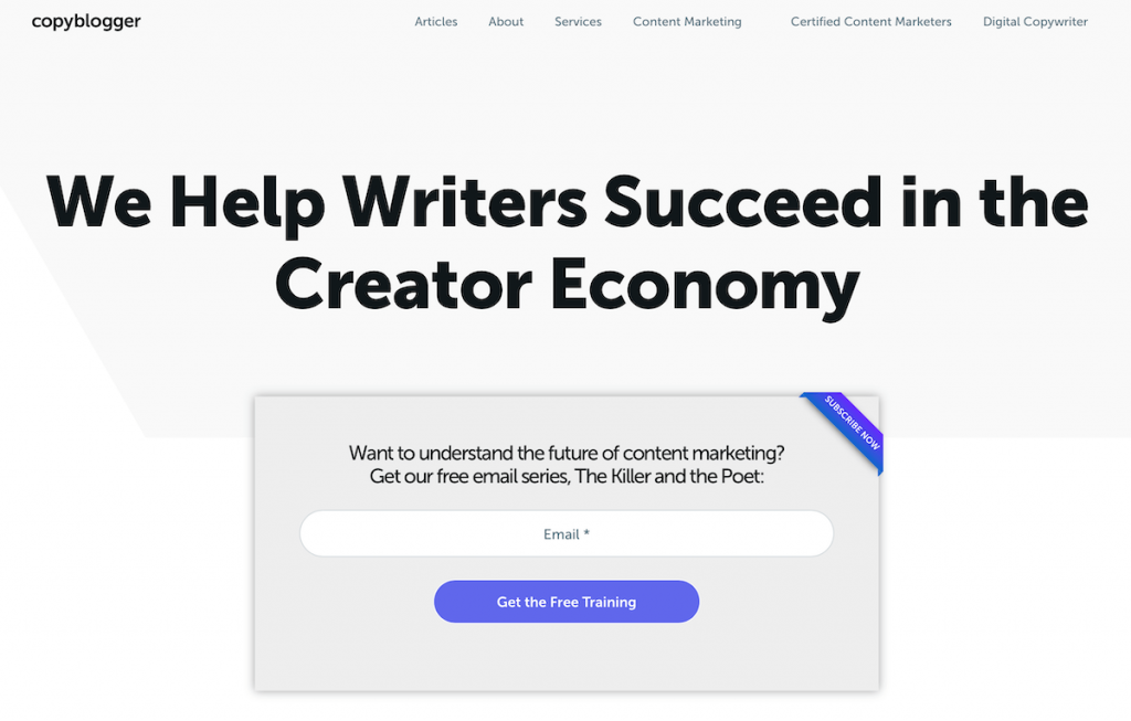
For instance, take a look at the prominent copywriting blog, Copyblogger. You will find tons of articles on tips for writing cheesy headlines for blog posts, but they have appropriately used the “say what it is” approach for their landing page headline. The same approach will work for your presentations too!
Conclusion
To draw the audience’s eye to your presentation, think of what you want them to look at first. For that to happen, you need to be aware of the traditional reading patterns and eye-tracking findings and accordingly insert elements on your slide. Knowing how your audience really perceives the information and ideas around them will allow you to make decisions about your content and its placement on the slides, thereby maximizing meaningful engagement.
Eye-tracking will help you see through their eyes, assisting you in taking the guesswork out of your presentation design research and giving you a great start. The excellent beginning point is to master the methods for motivating the eye movement of the viewers, and by doing that, you can easily set a solid foundation for the rest of your deck. Lastly, don’t ignore the importance of an excellent presentation design, which you can effortlessly achieve with professional presentation templates.
So, the next time you work on a presentation, go through these findings and check off the ideas and tips it has. Then, try to include any missing pieces in your draft. You’ll be thinking and acing your presentations like a true designer in no time.