
How efficient can your slides become with the help of visuals? Let’s find out.
Suppose you are an environmental company seeking to describe the ecological plight.
One slide mentions all the facts and figures regarding ocean acidification, climate change, and the loss of wildlife. The following slides show coral bleaching, smog, and extinct species.
Are the two slides individually self-explanatory?
Yes.
But are they similarly engaging?
A few slides with text blocks might not be disengaging, but an entire presentation like that can surely become a snooze fest for the audience.
The article will walk you through the relevance of visuals in a presentation and how you can use them to create slide decks that inform, captivate, and remain etched in the audience’s memory.
What is a Visual Presentation?
Visual presentations use tools like graphics, illustrations, data-driven charts, and other aids to communicate and accentuate the message. The target is to enhance comprehension and engagement, which is easier with apt visuals.
7 Reasons Your Presentation Needs Good Visuals
Without further ado, let’s walk through how visuals can greatly impact the efficiency of a presentation.
1. It Saves Time
Good presentations take time. Visuals can ease the process of writing blocks of text to explain a concept. For example, you can replace excessive bullet points with an apt visual that explains the information in itself.
It will also save the audience the trouble of reading everything. You don’t want your audience to miss out on your words because they were busy reading from the slides.
Self-explanatory visuals complement the words and make communication effective and easy.
2. Captures Audience’s Attention and Helps Them Remember
Research suggests the human brain processes visuals 60,000 times faster than textual information.
Rather than explaining complex information in texts and numbers, you can rely on attractive visuals like maps, illustrations, diagrams, infographics, and charts to describe timelines, processes, and concepts.
The audience will be more attentive towards you as they will look for you to explain the graphics. Attractive visuals also make it easy for people to remember the information.
3. Makes the Information More Catchy and Interesting
Imagine you are sitting through a university lecture, learning about how the brain works or maybe quantum physics. Can you sit through the entire lecture listening to the presenter alone, as good as he might be?
Or would you need help with texts on the slides to complement the presenter’s words?
Better still, how would you like intermittent videos to explain the concepts?
The most feasible setting would be complimentary texts and visuals that amplify engagement of the content. Visuals make slide decks more interesting, captivating, and memorable.
4. Enhances Understanding of the Audience and Inspires Action
We are different kinds of learners, and a lot of us rely on visuals for that.
When you explain a concept, usually the try is to conjure a picture in the people’s mind as it’s in your head. That’s what good and effective communication is.
Rather than solely relying on words, you can take the help of relevant visuals to communicate your words effectively.
Since visual communication is easy and effective, it will enable people to understand your message more efficiently and then act on it.
5. Visuals Help Convey Emotions

Conveying emotions is much easier when you can help people see them rather than explaining them through words.
Visuals are more emotive in that sense. Through videos and pictures, you can efficiently convey emotions like empathy, excitement, contentment, etc.
6. Presentation Becomes More Inclusive with Improved Clarity
Just the way one can’t use a single color and call it a rainbow – using only words to communicate in a presentation doesn’t make it comprehensive, either.
Audiences are linguistically and culturally diverse, with different preferred forms of learning. Including visuals in a presentation would make it more inclusive and coherent to people. The content would not be monotonous either, targeting only one mode of learning.
7. Adds Uniqueness and Credibility to the Presentation
Presentations are one way of brand communication. If you want to instill trust in your brand, invest in your brand collateral to make it more professional and credible.
A clearly defined and professionally crafted presentation will help the audience understand and connect to it more. When people can see through the message, it will automatically help them trust your business more, as a presentation would be an extension of you and your brand.
Invest in high-quality, professional visuals to upgrade the look of your presentation and convey authoritativeness and elegance to the audience.
How to Use Visuals to Make Your Presentation Stand Out?
The following tips will help you elevate your game by crafting a visually engaging presentation. Go through the rules and principles of design to create a visual masterpiece that efficiently tells your story.
a). Layouts With the Rule of Three

The presentation layout helps you create a neat slide deck.
Part your slide into a 3 by 3 grid. Place your texts and images at intersection points or along the lines.
It will help you create a balanced slide that makes effective use of the negative space and design elements placed at the correct location.
b). Add Interest With Visual Metaphors
You want to explain something. Use visual metaphors to make the concept more appealing, for instance, catchy roadmap templates to showcase a process or journey.

c). Use Visuals to Tell a Story

Storytelling isn’t just through words. You can use visuals like snippets and infographics to convey a story through your data. It will add more meaning and context to your content and make your visuals communicate better.
Weave a story around complex information as much as you can to make it more digestible and memorable for people. You can also create a visual narrative through your slides by placing them like a story. Each slide can be one piece of the narrative flowing into the next.
d). Take Help of Visual Hierarchy to Highlight and Emphasis
Use design principles like contrast, proximity, alignment, etc., to emphasize key information.
The visual hierarchy elements can help you highlight important information and make people see what you want them to see. It also adds variety and fun to your content.
e). Try Multimedia to Elevate Engagement
Static slides may seem monotonous. You can incorporate elements like animations, transitions, GIFs, animated logos, etc., to add interest to your slides.
However, remember not to overdo them, as it might make your slides look unprofessional and overcrowded.
f). Let Them See With a Before and After
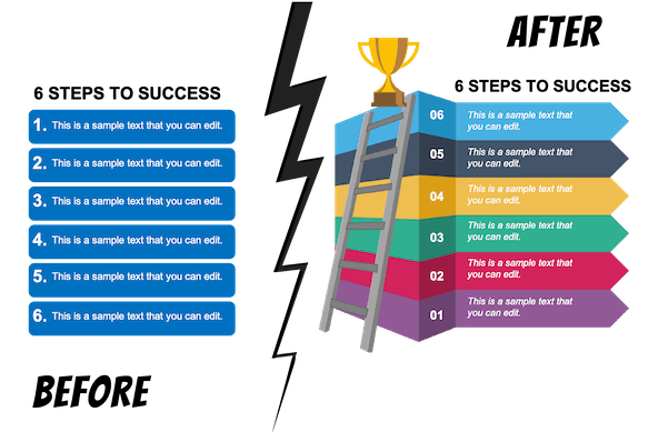
Want people to see why your solution matters? Nothing better than to show them a visual before and after. Let them know how it is today (before) and how your ideas will change it to the desired form (after).
A visual representation will make it easier for everyone to see through to your solution and follow your call to action (CTA).
g). Charts, Graphs, Tables, Icons to the Rescue
The right visual aids for your data can not only make it aesthetically appealing but also aid comprehension and retention. The data visualization tools work best with certain types of data.
For instance, dot plots are an excellent option for data with a clear order (ordinal data). For nominal data, stick to classics like bar or pie charts.
Histograms and line graphs are great for when you want to highlight your data, like in the case of interval ratios. You can add icons and images to add visual appeal and meaning to your data.
All these tools will enable you to break complex data into digestible knowledge and, at the same time, not overwhelm people with information overload. Make sure that the tools you use fulfill a purpose and align with your end message.
h). Visual Quizzes and Polls
A presentation must be interactive for the audience to feel like a part of it. One-way communication and you wouldn’t have the means to know whether the audience has really been with you throughout the length of your presentation.
One way to figure that out is by including quizzes and polls. You can use some quick, fun images (Q&A, Quizzes, Polls) that can include people and serve as a mini-break for them from listening.
It will also enable you to form connections with people and vice versa.
Things to Remember
- Don’t overstuff the slides with text or visuals; strike the right balance between the two.
- Avoid low-quality visuals.
- Your slides should have design consistency, i.e., you can’t go for distinct types of fonts, colors, or formats for different pages. It will look unprofessional and a visual mess.
- Make sure your presentation is accessible to people with disabilities as well.
- Remember not to overdo animations and transitions in your slides.
- If you choose to include interactive elements in your slides, remember to test them before.
- Use funny and interesting pictures to spice up your icebreaker activity.
Summing It Up
Including visual aids in your presentation is imperative if you want to boost engagement for your slides. However, you can’t stuff up your pages with random infographics, charts, illustrations, or other things.
Firstly, every element you use must align with the overall message and be coherent with each other. That’s how you determine the efficacy of your presentation.
Secondly, however you choose to fill your slide decks – the combination of texts and images – remember that they are just there to complement your words. So, practice creating an impeccable speech as much as you can.
With the right combination of visual aids and a carefully crafted speech, you can count on creating a slide deck that indeed brings your message home.