
6 Row 4 Column Table
In stock
$5.00
item details (1 Editable Slide)
- Applications Supported: PowerPoint, Google Slides
- File Type: .pptx, Google Slides
- Aspect Ratio:16:9 (Wide Screen)
- Animation: Yes
6 Row 4 Column Table
6 Row 4 Column Table
(1 Editable Slide)
Related Products
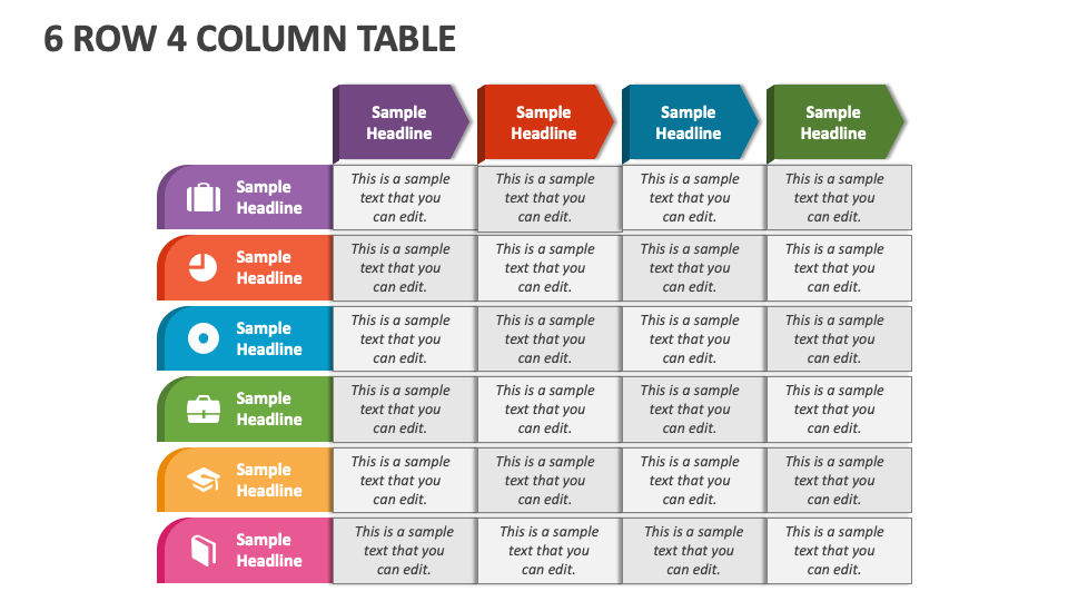
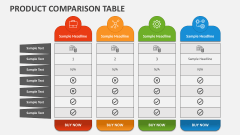
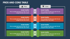
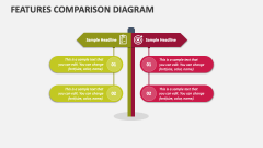
Leverage our intriguing 6 Row 4 Column Table presentation graphic for MS PowerPoint and Google Slides to depict a comparative overview of sales figures across various regions, the status of six different projects measured across four different variables or metrics, and more such information.
Financial analysts can highlight the revenue, expenses, and profits associated with the six different business units or products. Researchers can utilize this versatile graphic to present responses for six different questions across four answer options in a particular survey. Team leaders and HR managers can illustrate performance ratings or scores for employees based on different performance criteria.