
Risk Heat Map
In stock
$5.00
item details (6 Editable Slides)
- Applications Supported: PowerPoint, Google Slides
- File Type: .pptx, Google Slides
- Aspect Ratio:16:9 (Wide Screen)
- Animation: Yes
Risk Heat Map
Risk Heat Map
(6 Editable Slides)
Related Products
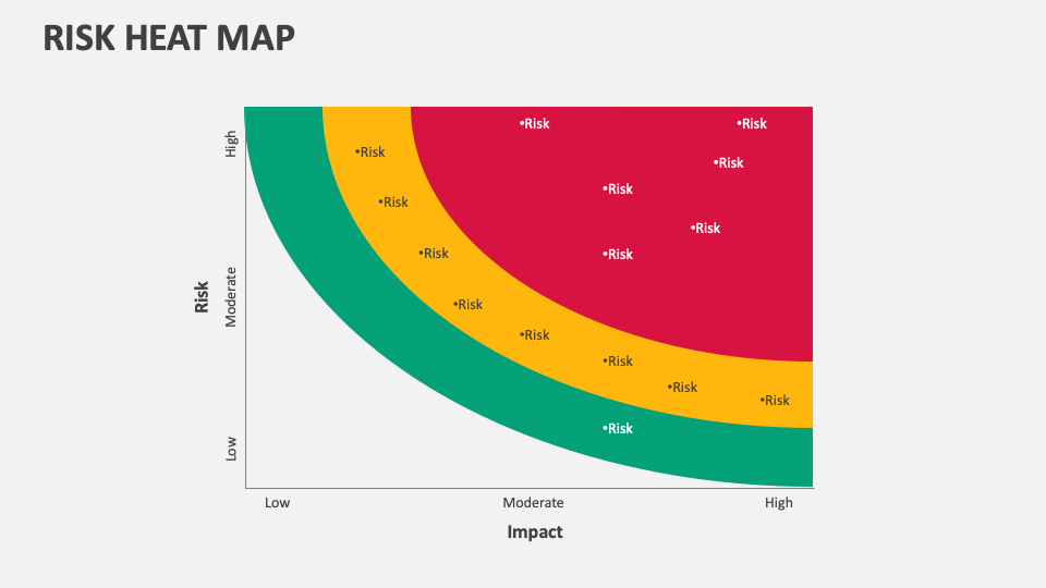
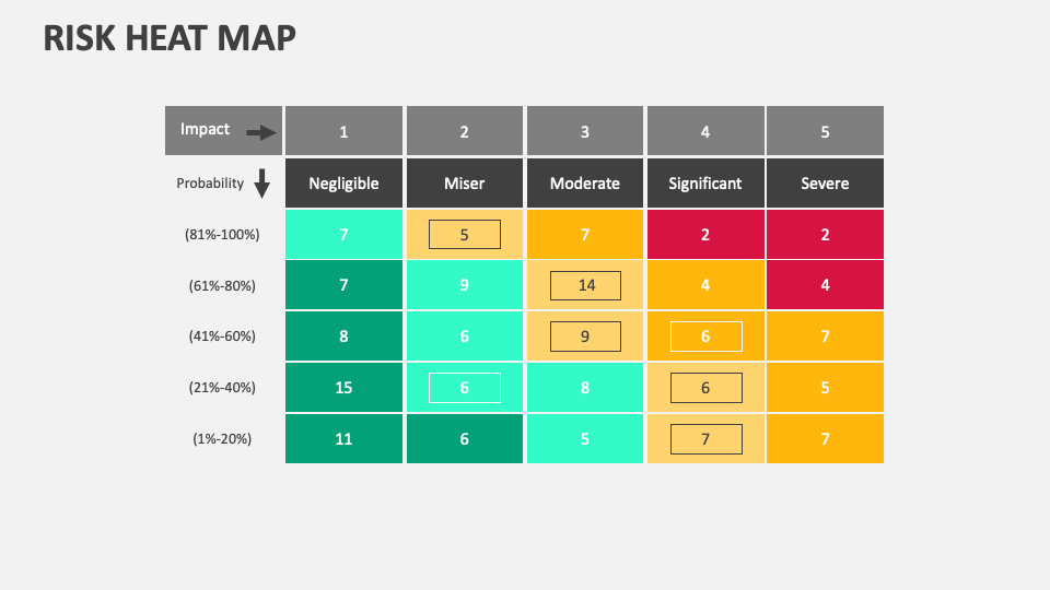
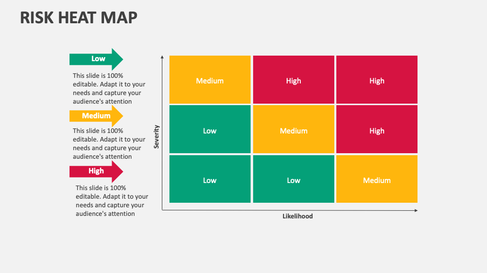
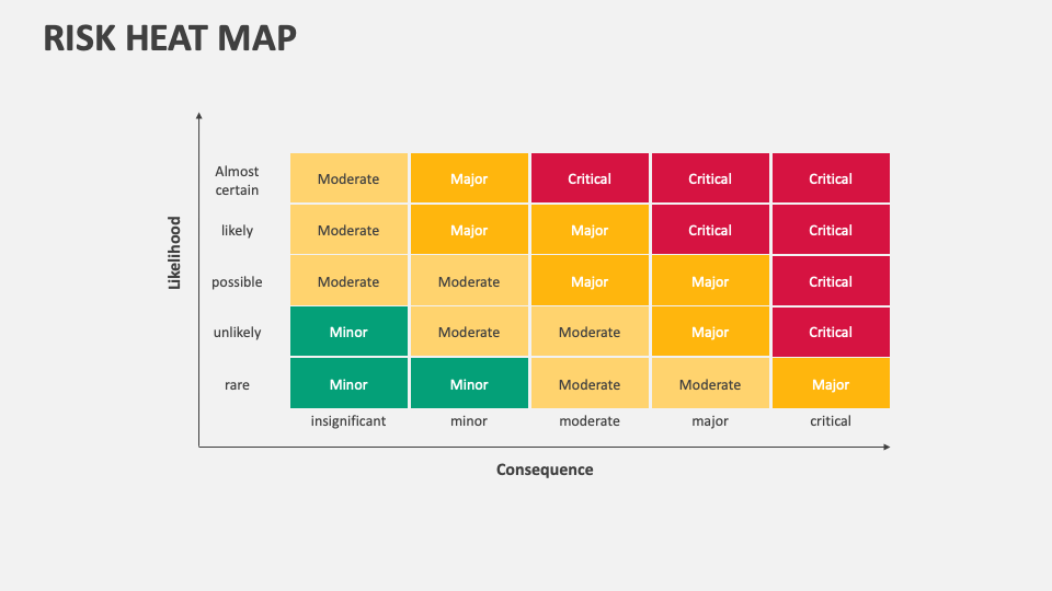
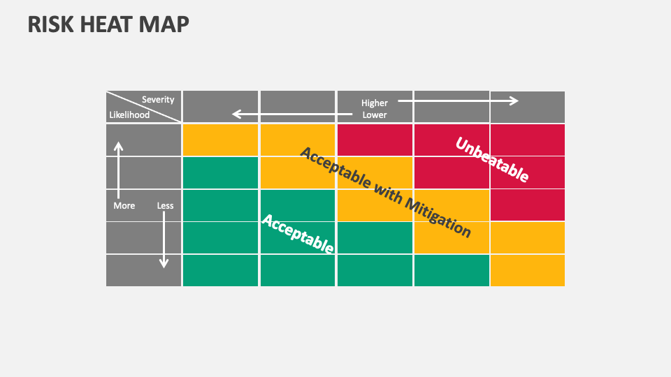
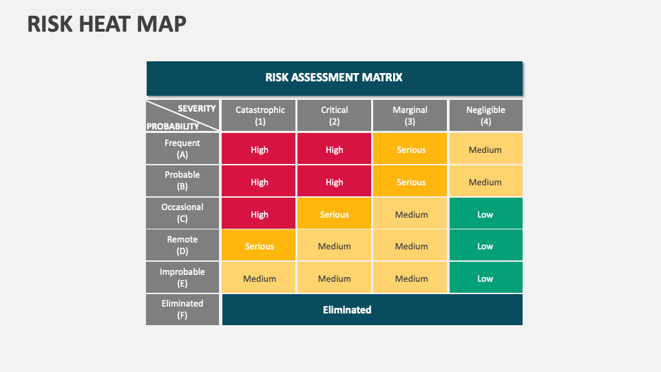
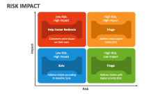
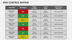
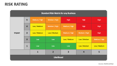
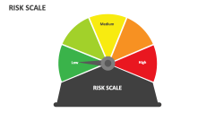
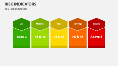
We have come up with the Risk Heat Map MS PowerPoint and Google Slides presentation template to help you showcase the visual tool used for displaying and analyzing the level of risk associated with various factors or events in a project, organization, or process. Download it right away!
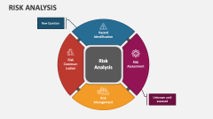
Risk analysts and subject matter experts can make the most of this set to showcase the role of this tool in assisting professionals in mapping the risks on the basis of their likelihood and severity. You can depict how this map uses colors to represent different risk levels, ranging from green (low risk) to yellow (medium risk) to red (high risk). You can also shed light on the scenarios where this map is best applicable.