
We live in a world where attention spans fade quickly, and there is a truckload of distractions. To present our points in a way that gets the audience on their toes and keeps them invested throughout the slideshow is indeed a task, and one of the most effective strategies to do so is by adopting the practice of minimalism in presentations.
Minimal presentations convey ideas in a concise, clean, and neutral manner. They are a beacon of simplicity and elegance and can help you make an impact in a cacophony of information.
In this article, we will take you through reasons why minimalism is necessary and ways to incorporate it into your presentations.
1. Enhances Clarity
The key aim of a presentation is to deliver content that is easy to understand. Thus, minimalism is a powerful tool that can help one achieve such objectives by redirecting the light to the core message.
When a presentation is cluttered with excessive text, graphics, and extra details, the essential content gets buried. In contrast, minimalist design ensures that the attention is drawn to what truly matters, making it easier to grasp the central idea or key takeaways.
2. Lays Emphasis on Professionalism
It doesn’t matter if you are a student, teacher, manager, or executive; when it comes to presentations, professionalism is a vital element. It reflects your attention to detail, commitment to the presentation, and understanding of the subject.
For instance, imagine you are an investor hearing some pitches from entrepreneurs. The first one commences with a slide that is full of information, has extensive data about finances, and is bombarded with way too many colors and visuals. Even though his numbers were good, you feel a little withdrawn.
The next entrepreneur presents his slides- they are set in a neutral theme with readable fonts, have all crucial information, and neatly organized data. There are some elements and creatives, and the overall theme is aesthetically pleasing.
Which entrepreneur would you take more seriously? Of course, it would be the second one as his slides reflect his sincerity towards his work, showcase professionalism, and demonstrate his cadre as an individual.
Thus, when presentations are set in minimal themes, they increase your credibility and stature.
3. Eases Comprehension of Complex Information
Improved comprehension is a critical goal, especially when dealing with intricate ideas or complex data. Minimalist design plays a pivotal role in achieving this goal by simplifying the visual aspect of the presentation and reducing noise and complexity. This makes understanding of the message effortless for the audience.
This approach is particularly more valuable when conveying scientific concepts, detailed technical specifications, or complex financial data.
4. Reflects a Sense of Luxury
Minimal presentations reflect a sense of luxury. Using simplicity and restraint in design exudes an air of elegance and sophistication.
When a brand embraces minimalism in its presentations, it signals to the audience that it is confident in the intrinsic value of its product or service. This is often a hallmark that they rely on the quality and craftsmanship of their offerings.
Ways to Incorporate Minimalism in Your Presentation Design
1. Harness the Power of Pre-Designed Templates
Making minimal presentations can be quite tricky, especially when you are not a professional designer. Rather than spending hours trying to perfect your deck, it is wiser to use pre-designed templates that make your slides look minimal and aesthetic.
Since experts craft these templates, they are exceptionally well put together and reflect sheer minimalism, making your presentations stand out. You can customize each template element in a few clicks, adjust the fonts, change colors, etc.
2. Limit Text
Limiting text is a fundamental principle to create visually uncluttered slides. When a slide contains excessive text, the audience may become overwhelmed, causing them to disengage or miss the key points.
Instead, opt for one to three clear messages per slide. This approach allows your audience to absorb the information more effectively, increasing the likelihood that they will remember and understand your message.
3. Embrace White Space
White space, also known as negative space, is the area on a slide that is deliberately left empty. By creating white space on your slides, you allow the audience to understand and process the presented information harmoniously.
White space also acts as a visual guide, ensuring the core message is the focal point. It pinpoints the critical moment and eradicates any unwanted elements.
4. Stick to One Brand Palette
Simplifying color schemes and adhering to two to three colors enables you to create cohesion and consistency in your presentation. This approach makes your slides visually stunning and also reinforces your brand identity.
Let us understand with the example given below. In this brand proposal presentation, the slides are crafted around two or three key colors that reflect the company’s aesthetics. It not only adds more value to the presentation but also embeds the brand’s identity in the minds of the viewers.

5. Harness the Power of Icons
Incorporating icons into your presentations is a powerful technique to enhance clarity and engagement. Icons can effectively convey complex ideas or concepts without lengthy explanations. By using simple and intuitive icons, you make your message more accessible and easily understandable to a broader audience. It not only reduces cognitive load but also adds a visual layer to your presentation, making it more engaging and memorable.
6. Keep an Eye on Typography and Fonts
Fonts and typography play a pivotal role in minimal presentation design for several reasons. First and foremost, they greatly influence the overall aesthetics and readability of the presentation. A carefully selected font can enhance the visual appeal of the slides, while typography choices can ensure that the text is easily readable from various distances.
In a minimal design, fonts are like the silent actors that convey the presentation’s tone and style. So, it is critical to select fonts that align with the desired message and brand identity.
You must ensure that your headings, sub-headings, and paragraphs speak about the line of order. This means that your title should be in the largest font, followed by the other two, and must have similar fonts that pair well. Let us understand the examples given below.
Here is an example of how you can combine two fonts from different families, like cursive and sans-

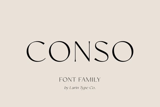
Or you can use fonts of the same family like this-
Conclusion
By artfully distilling your content and carefully crafting the slides, you can master the art of minimalism in presentations. Be it the confines of a boardroom or the grand stages of conference rooms; minimal presentations can help you transform your message and convey it in a much more convincing and appealing manner.
We hope these tips help you understand why minimal presentations are essential and the ways in which you can build them.