
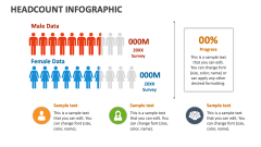
Headcount Comparison
In stock
$5.00
item details (3 Editable Slides)
- Applications Supported: PowerPoint, Google Slides
- File Type: .pptx, Google Slides
- Aspect Ratio:16:9 (Wide Screen)
- Animation: Yes
Headcount Comparison
Headcount Comparison
(3 Editable Slides)
Related Products
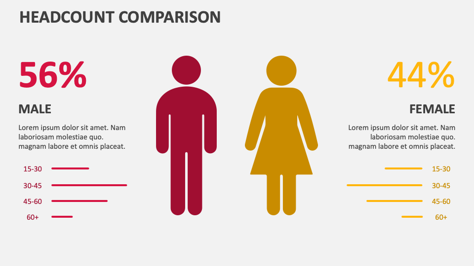
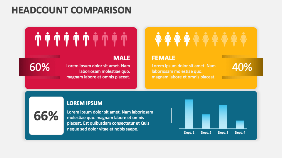
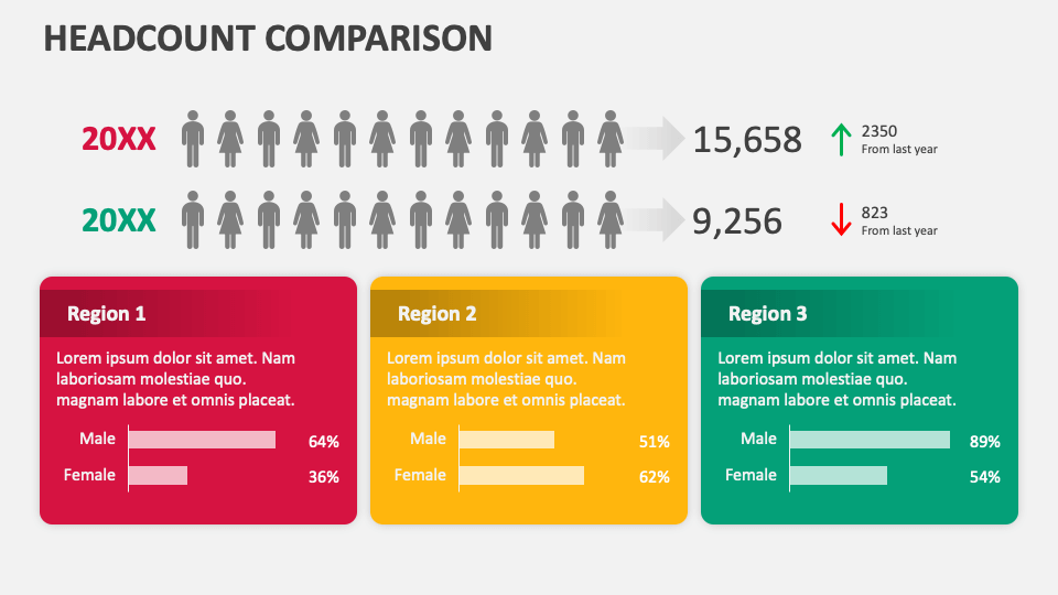
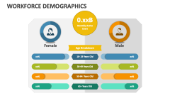
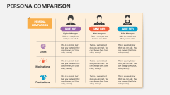
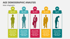
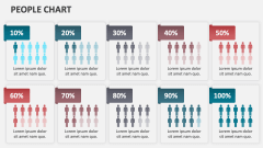
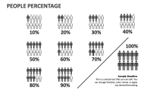
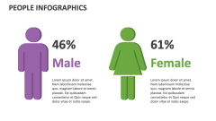
Download our Headcount Comparison presentation template for PowerPoint and Google Slides to present the results of the analysis or survey in a structured and concise manner. The clear backdrop with horizontal and vertical bar graphs and eye-pleasing illustrations will make data visualization impressive.
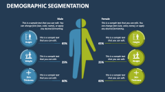
Sales managers can use these slides to showcase the region-wise increase or decrease in male and female customers over a specific period. HR managers can visualize the ratio of male and female employees in various offices and a particular department of the organization. The deck can also be used to depict the population distribution by gender and age groups, statistics related to age and gender-specific use of social media, and more. As the slides are 100% editable, you can effortlessly make changes to them according to your requirements.