




Histogram - Data Driven
In stock
$5.00
item details (7 Editable Slides)
- Applications Supported: PowerPoint, Google Slides
- File Type: .pptx, Google Slides
- Aspect Ratio:16:9 (Wide Screen)
- Animation: Yes
Histogram - Data Driven
Histogram - Data Driven
(7 Editable Slides)
Related Products
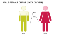
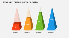
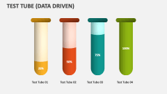
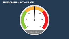

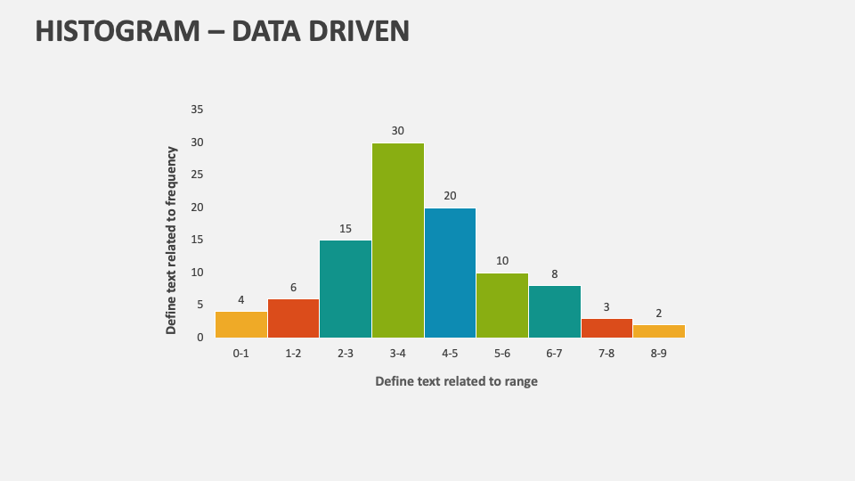
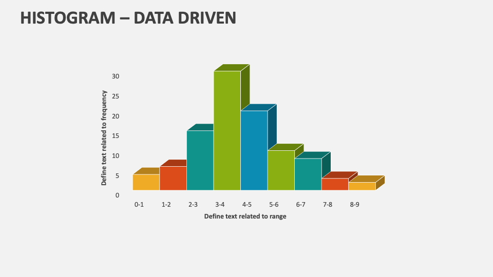
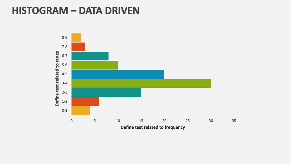
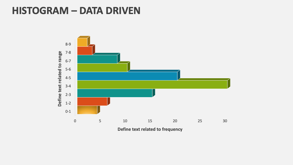
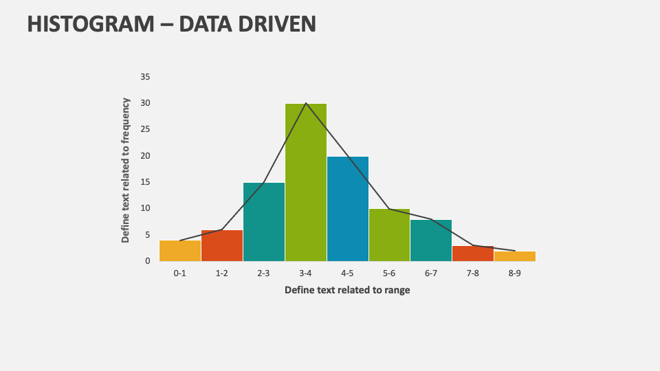
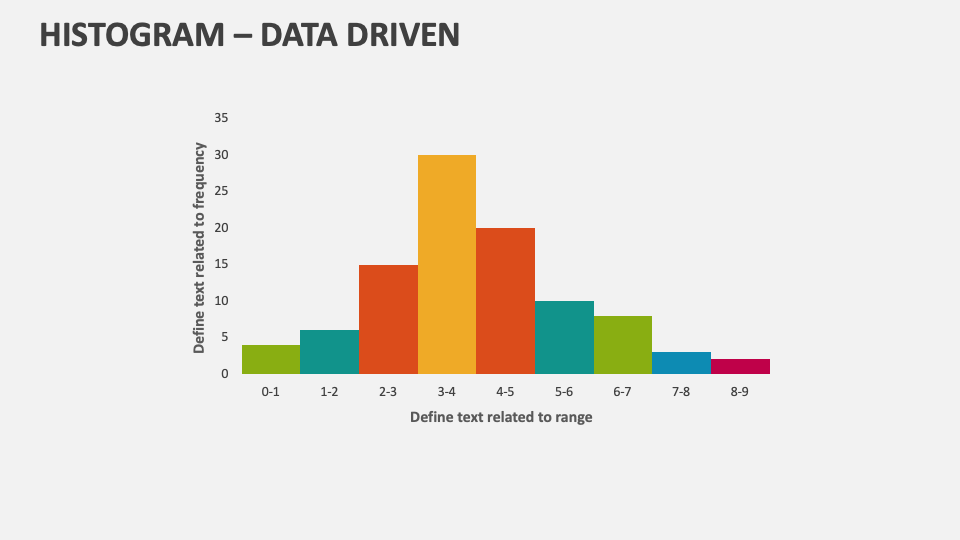
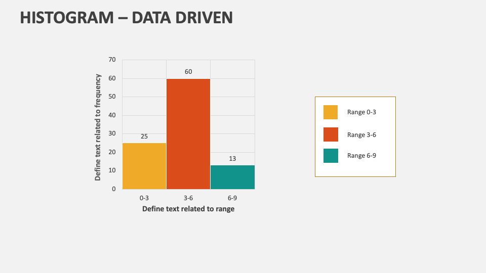
We have introduced the Histogram-Data Driven MS PowerPoint and Google Slides presentation template to help you present topics like various survey responses, sales numbers by revenue ranges, and other statistical data. Download this deck now and present important information related to frequency distribution of data in a well-structured manner.
Business leaders will find this deck helpful in showcasing the distribution of business expenses and budgets across different departments or regions. Sales heads can illustrate the customer purchase frequencies, monthly/quarterly sales trends and patterns, etc. Quality control experts can shed light on manufacturing defects or quality control issues across different categories or time periods. Educators can include these slides in their presentations to depict test scores or exam results.