
P-F Curve
In stock
$5.00
item details (12 Editable Slides)
- Applications Supported: PowerPoint, Google Slides
- File Type: .pptx, Google Slides
- Aspect Ratio:16:9 (Wide Screen)
- Animation: Yes
P-F Curve
P-F Curve
(12 Editable Slides)
Related Products


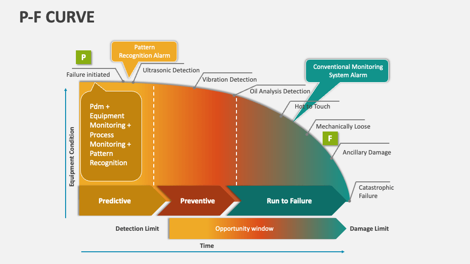
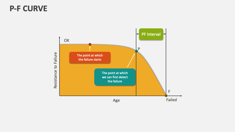
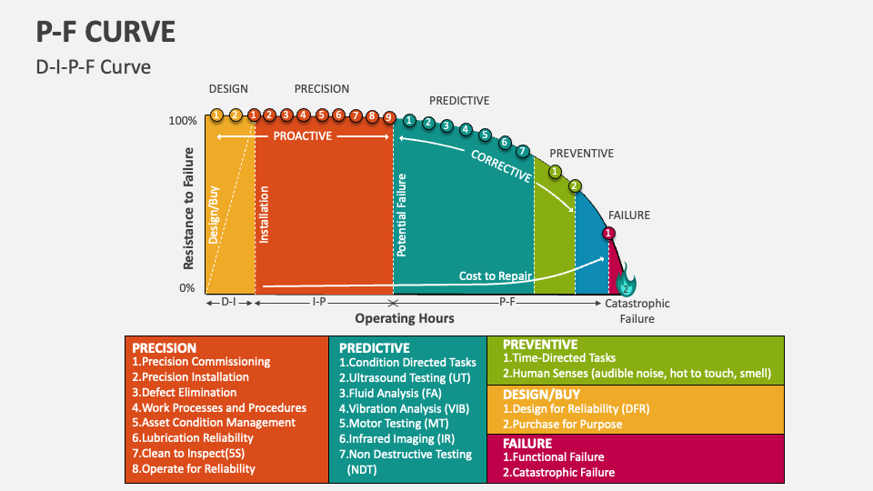
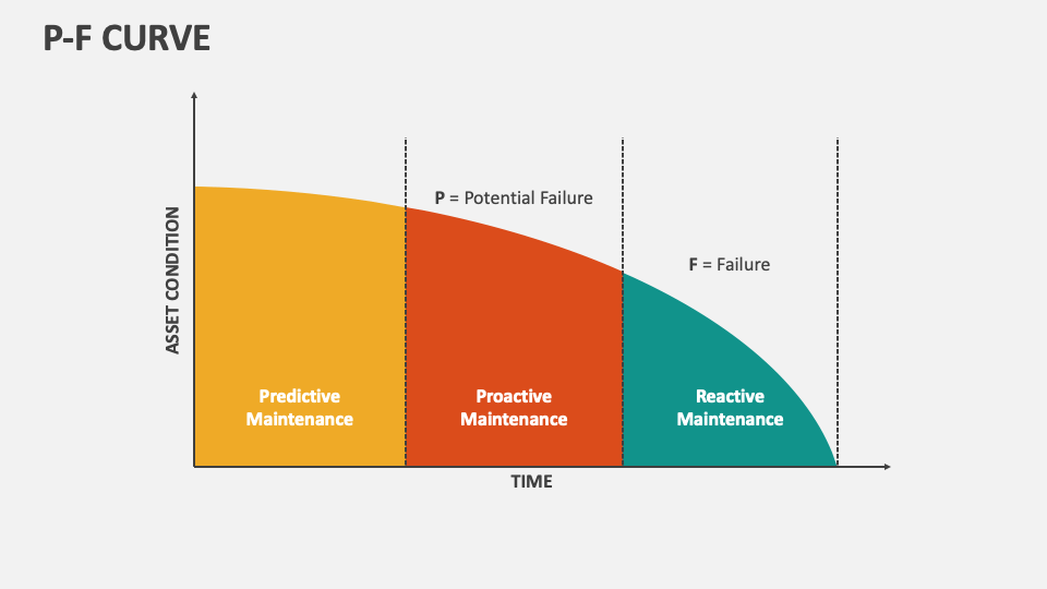
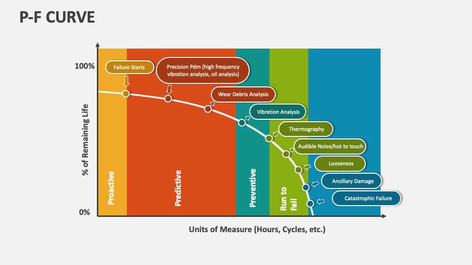
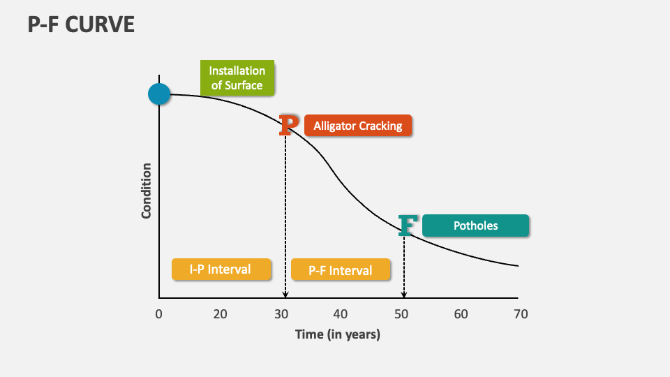
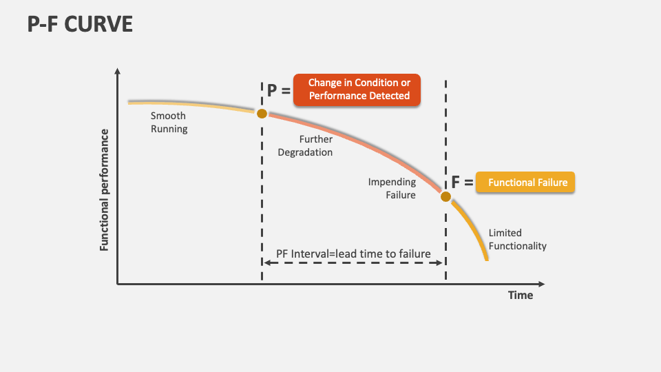
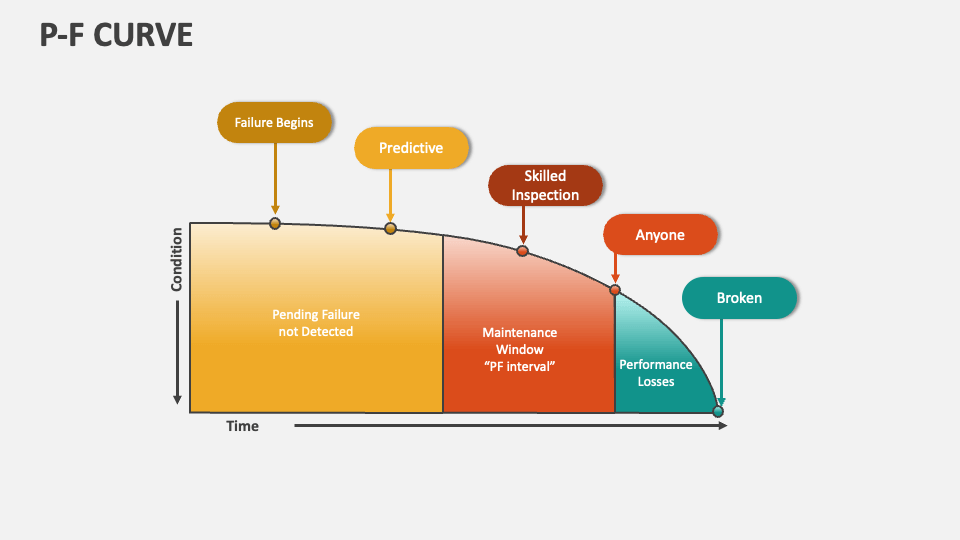
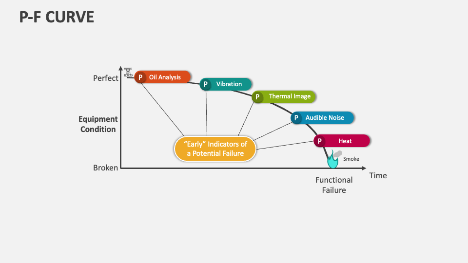
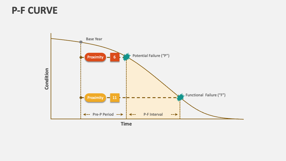
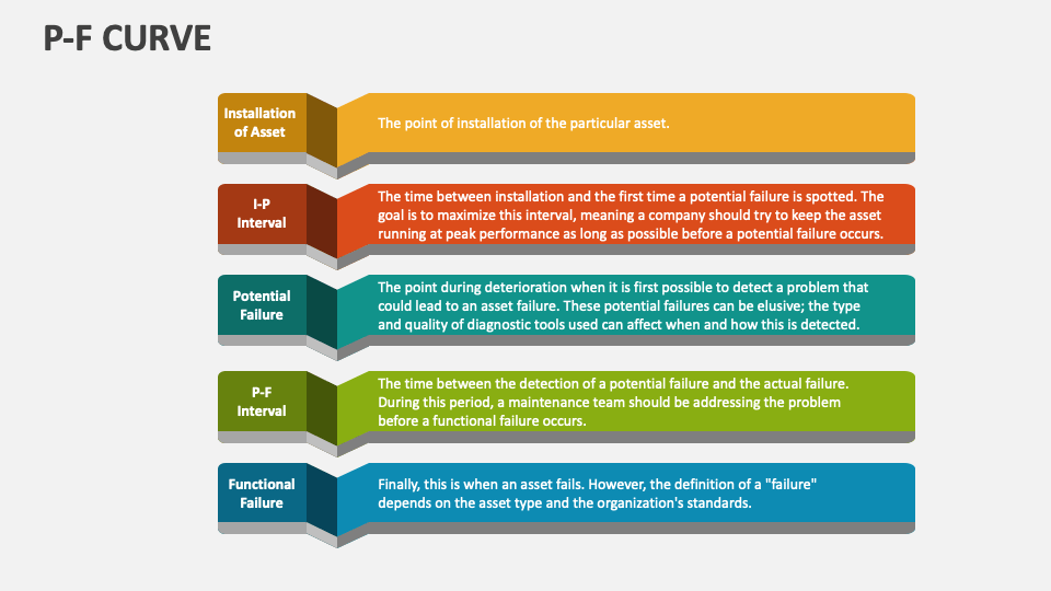
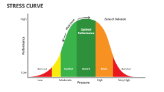
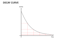
Grab our MS PowerPoint and Google Slides presentation template to describe how The P-F Curve outlines the relationship between the detection of a potential failure (P) and the progression of that failure to functional failure (F). You can explain how organizations can implement timely and cost-effective maintenance strategies by understanding the P-F interval.
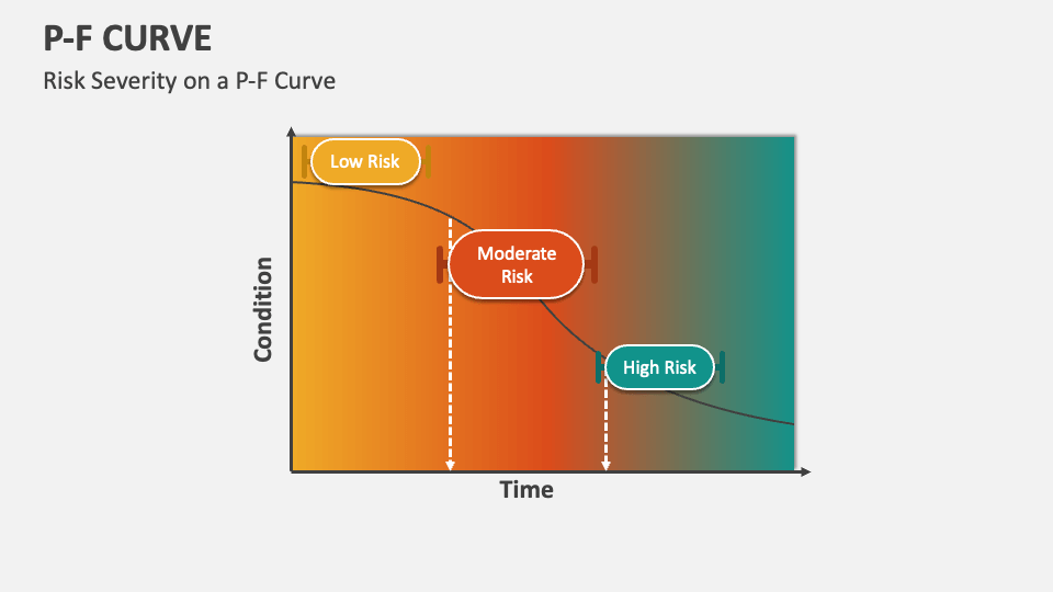
Risk analysts and operations managers can use this set to present a graphical illustration of how an asset’s condition depreciates over time. You can depict how the P-F (Potential Failure) Curve helps represent the stages through which assets attain failure. You can further highlight the risk levels associated with the degradation and failure process of systems/assets, i.e., low risk, moderate risk, and high risk.