
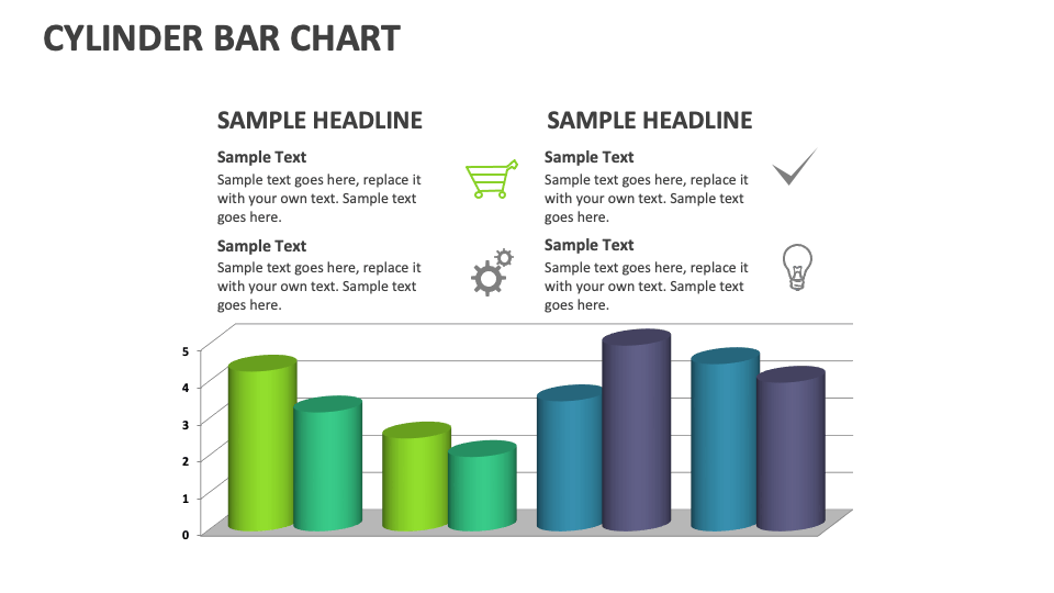
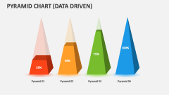
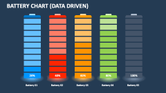
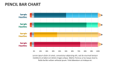
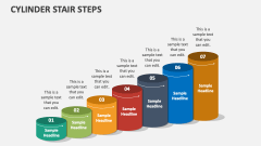
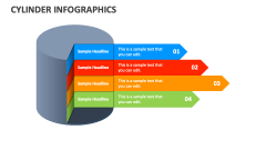
Cylinder Bar Chart
In stock
$5.00
item details (9 Editable Slides)
- Applications Supported: PowerPoint, Google Slides
- File Type: .pptx, Google Slides
- Aspect Ratio:16:9 (Wide Screen)
- Animation: Yes
Cylinder Bar Chart
Cylinder Bar Chart
(9 Editable Slides)
Related Products
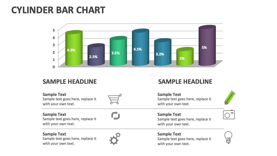
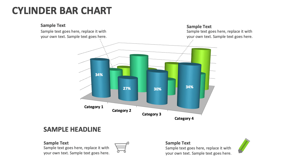
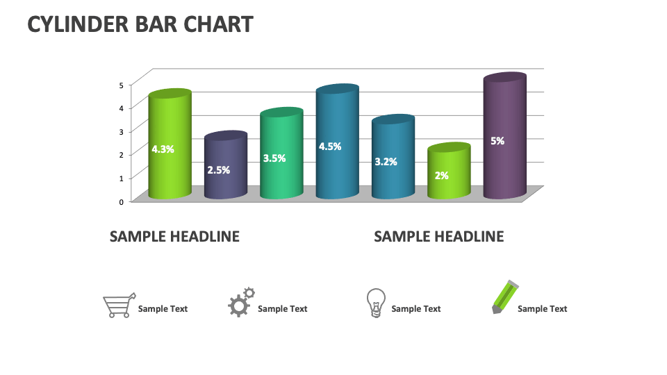
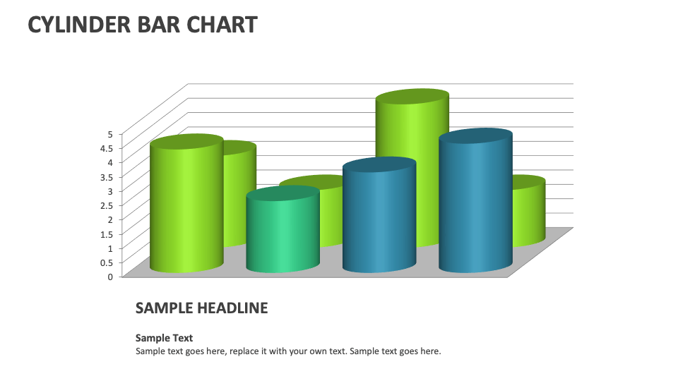
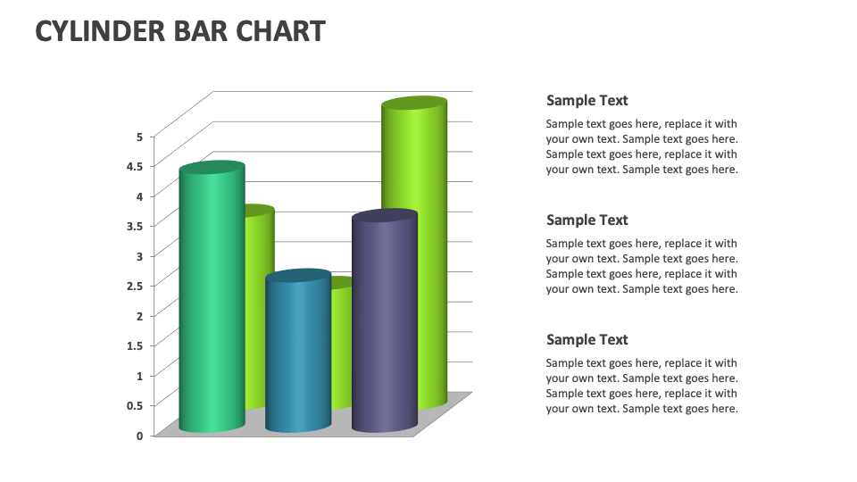
Grab our Cylinder Bar Chart for MS PowerPoint and Google Slides to present a brand’s sales or profit over a time period, the market share held by various companies in a sector, different categories of expenses, and more. The deck features attention-grabbing charts that will make data visualization simpler and effortless.
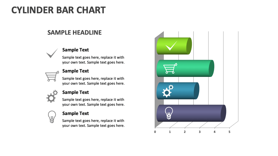
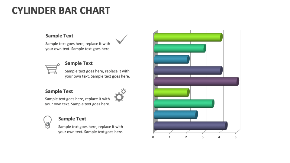
Project heads can use this deck to showcase the percentage of completed project tasks or milestones. Business leaders can shed light on the revenue incurred from different branches or locations. Sales and marketing heads can demonstrate the number of customers from multiple regions, the effectiveness or percentage conversion of various marketing campaigns, and more. HR heads can visualize the percentage of employees completing training programs, turnover rates across departments over the years, etc.