
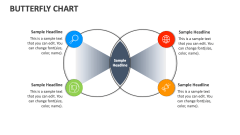
Butterfly Pie Chart
In stock
$5.00
item details (4 Editable Slides)
- Applications Supported: PowerPoint, Google Slides
- File Type: .pptx, Google Slides
- Aspect Ratio:16:9 (Wide Screen)
- Animation: Yes
Butterfly Pie Chart
Butterfly Pie Chart
(4 Editable Slides)
Related Products
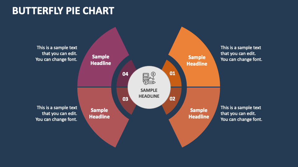
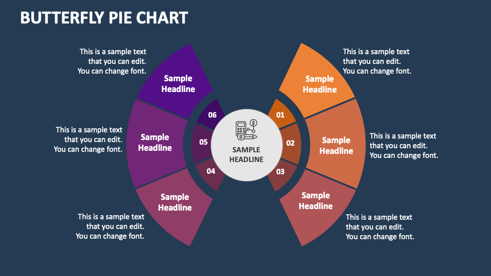
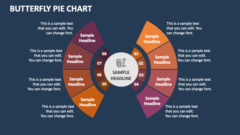
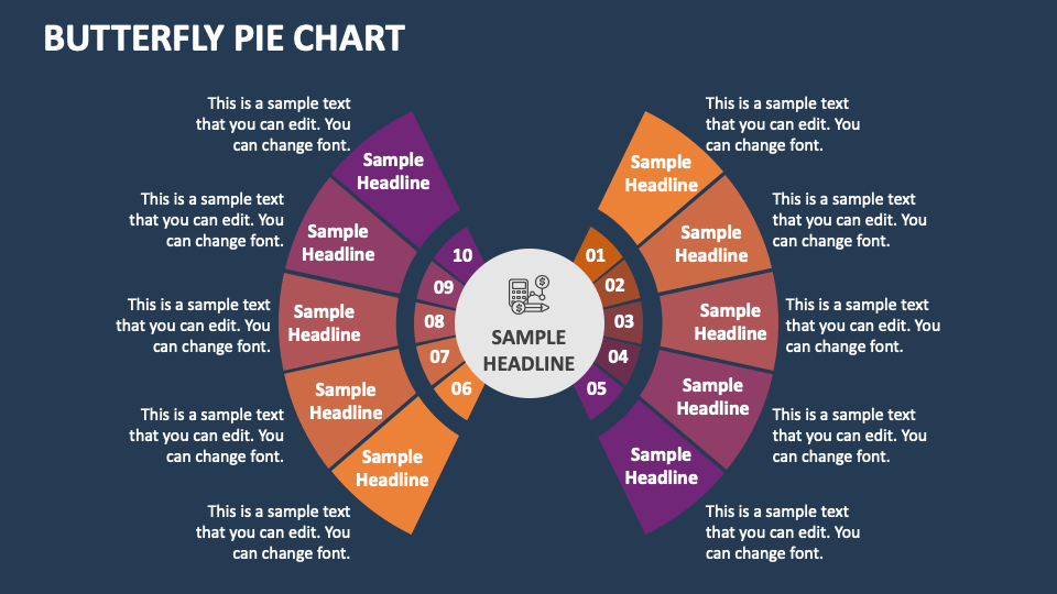
Download our Butterfly Pie Chart presentation template for MS PowerPoint and Google Slides to depict the similarities and differences between various data sets. The striking graphics will help you present essential information in a comprehensible manner.
Business leaders can utilize this set to depict their business’s market share comparisons, budget allocations, and statistics of multiple business units. Sales professionals can shed light on product performance across different regions, branches, and customer groups. Marketers can showcase the performance and effectiveness of advertising campaigns through various channels. HR professionals can use this deck to highlight retention rate, churn rate, and other information in an engaging way.