




Ring Chart
In stock
$5.00
item details (6 Editable Slides)
- Applications Supported: PowerPoint, Google Slides
- File Type: .pptx, Google Slides
- Aspect Ratio:16:9 (Wide Screen)
- Animation: Yes
Ring Chart
Ring Chart
(6 Editable Slides)
Related Products
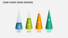
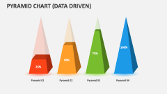
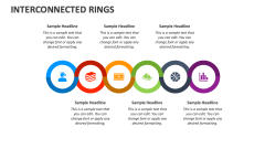
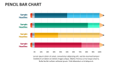
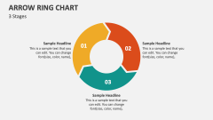
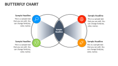

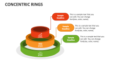
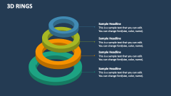
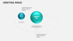

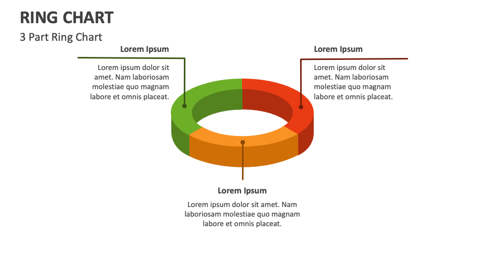
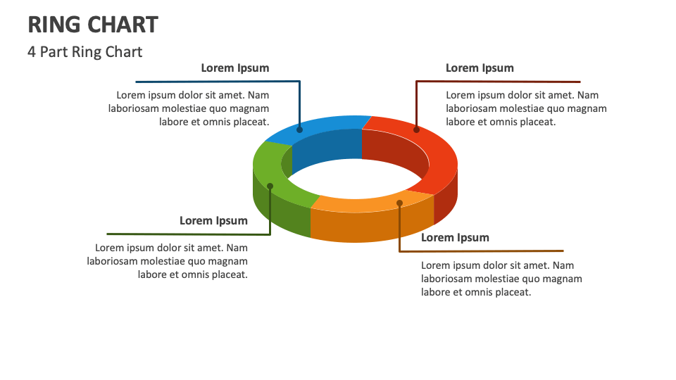
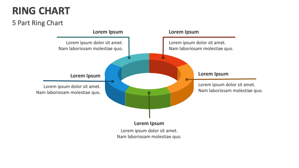
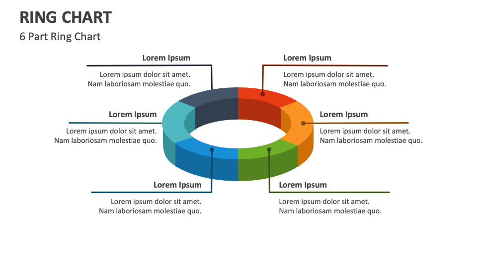
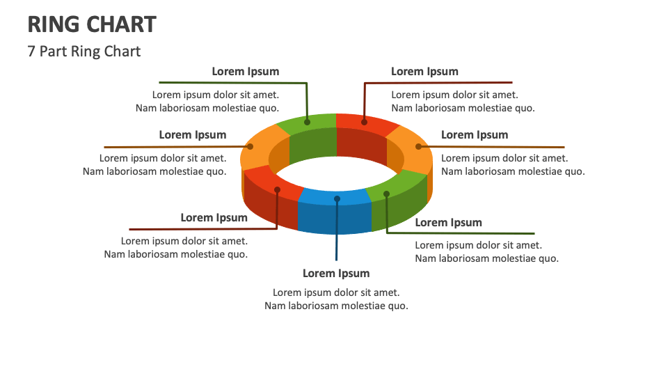
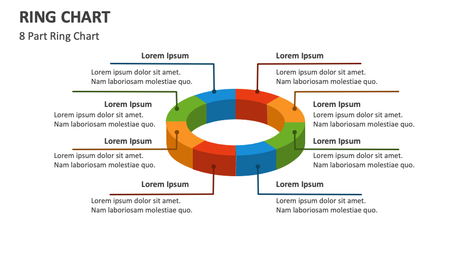
We have come up with the Ring Chart for MS PowerPoint and Google Slides to help you showcase topics about relationships, distributions, and comparisons in a visually appealing manner. This fully customizable template will help you earn admiration and accolades from the audience.
Business owners can utilize this versatile set to illustrate the proportion of revenue obtained from different product lines or business units. Sales and marketing heads can depict the distribution of customers across different segments, the allocation of marketing budgets to multiple channels, etc. Educators and researchers can highlight the population ratio of males and females, how faculty members allocate their time among teaching, research, and administration, and more.